You can get this project file with the Channel Membership – Click Here
Quick rundown of all the nodes used within this project.
We start out with a background node ( All of the channels should be set to 0 )
Next we add a grid node (Setting the grid to 9 rows and 16 columns with a major line spacing of 2 )
We add another background but connect the grid to the new background with the mask connection. You will need to change the mask setting to channel to red, green, or blue and not the default alpha.
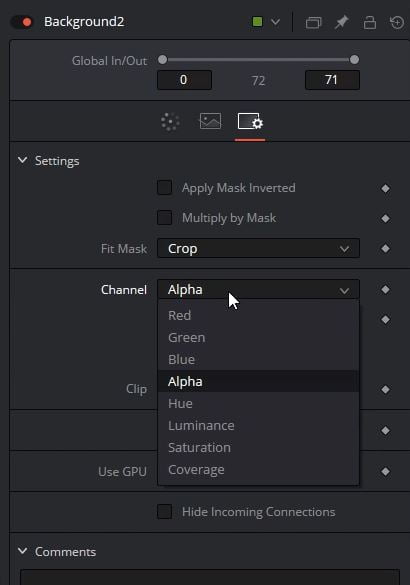
Next you can change the background color to change the color of the grid.
To make the grid smaller we will add a transform node and change the size and you will need to change the edges to mirror.
For the real background of this project you can really add anything but I used the FastNoise node to just add a little bit of randomness to the background.
This is how our node tree is looking this far

To add a bit more depth to the image I’m going to add a vignette using a background node and a ellipse mask.
The new background node will be black and we will connect the ellipse mask to this background node and check the invert on the mask
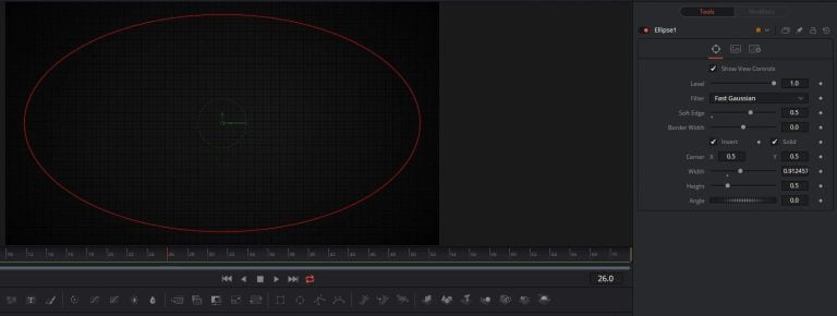
Make sure you add some soft edge to this mask also.
So that is everything for the background. Lets start building the text title part of this project.
For this part of the project you will need some type of texture image to build this part of the effect.
Bring in a text node and the texture image you will be using.
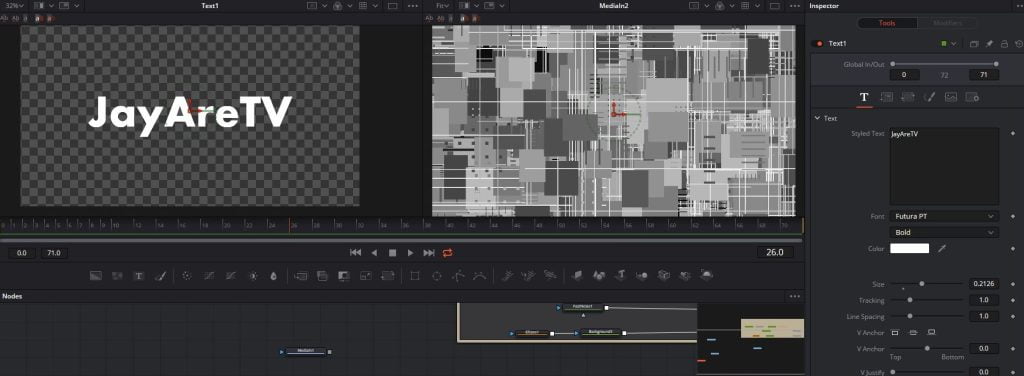
We will be connecting the text node into the texture node via the mask connector
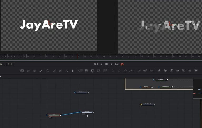
After the image (MediaIn) node we will connect a Emboss node.
We will need to change the style to Emboss Over and you can play with the power and angle to your liking.
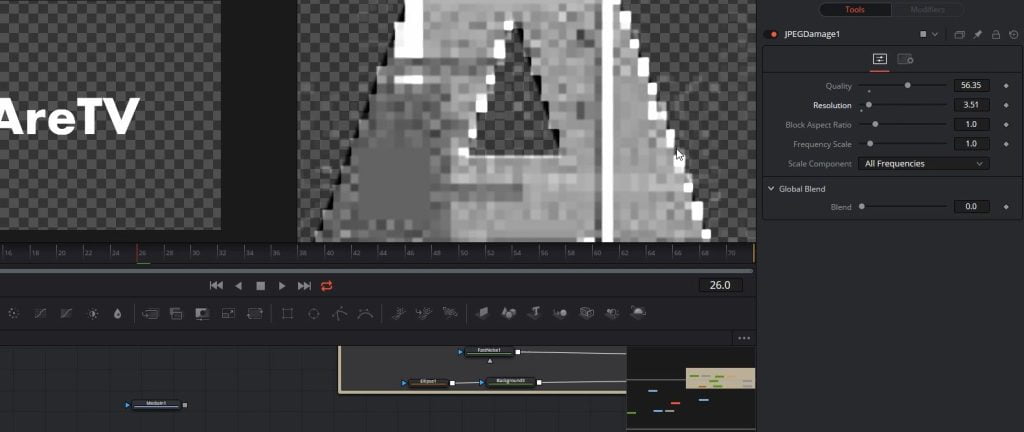
We will be splitting this effect into two parts the first one we will need the JPEGDamge node. Play with the setting till you get something to looks similar to this.
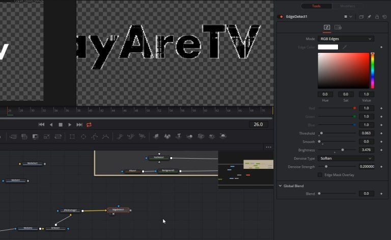
Next lets add edge detect. You will need to play around with the threshold smooth and brightness.
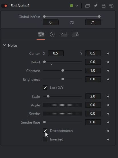
Now to color everything we will be using fast noise. You will want to change the detail of the fastnoise node to 0 and check discontinuous.
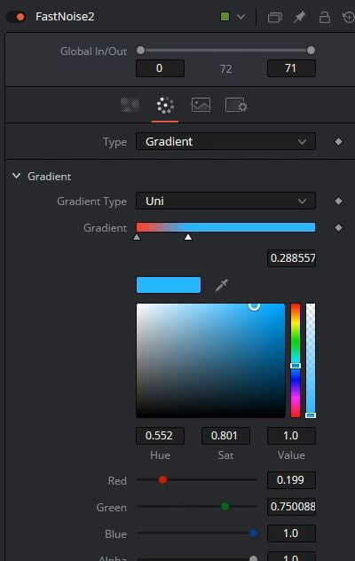
On the color page for type change this to gradient. Next change the color on the gradient to colors you like.
To connect this to our node tree we will need to use a bitmap node. Once we connect the bitmap we will need to change the bitmap channel to luminance.
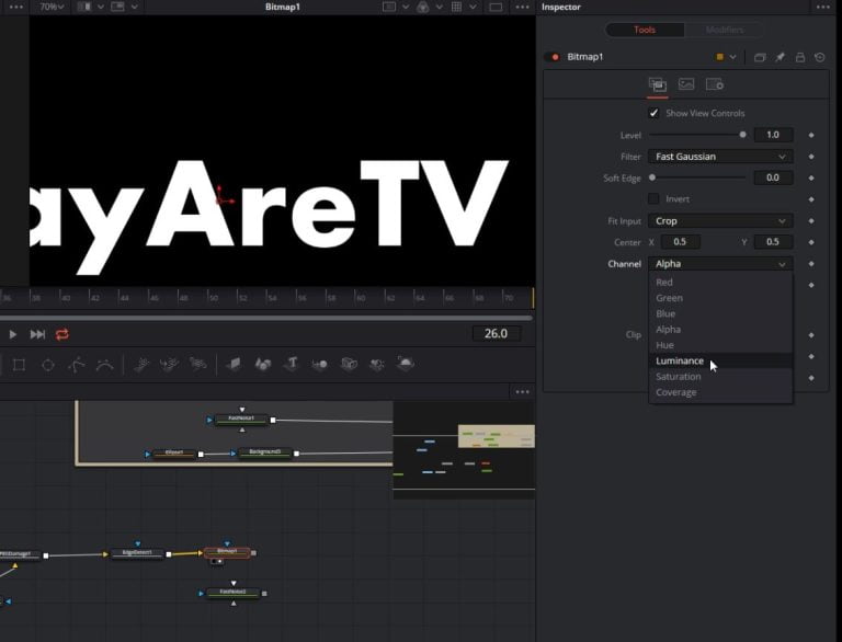
Once we have that changed we can now add the bitmap to the fastnoise node. We will want to connect the bitmap to the noise brightness map connector

We will also want to connect the bitmap to the blue fastnoise mask connecter.
You should now see the different color based off the brightness of the bitmap we added.

If you think the others are not that bright you can add a brightness contrast node after the fastnoise.
Next to add the internal effects we can copy a bit from our project. I’ll copy the bitmap and fastnoise. Just highlight and ctrl + C to copy and ctrl + V to paste the nodes. We are going to next connect from the emboss node into our new bitmap we copied.
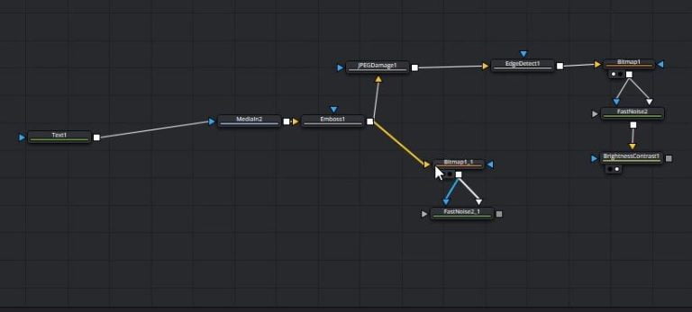
If you view this part of the node tree you should see the same type of effect for the inside
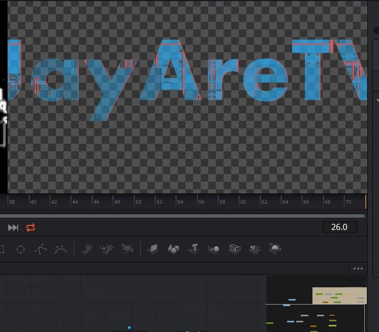
We can connect all of this to a merge and lay it on top of our edge part of this effect.
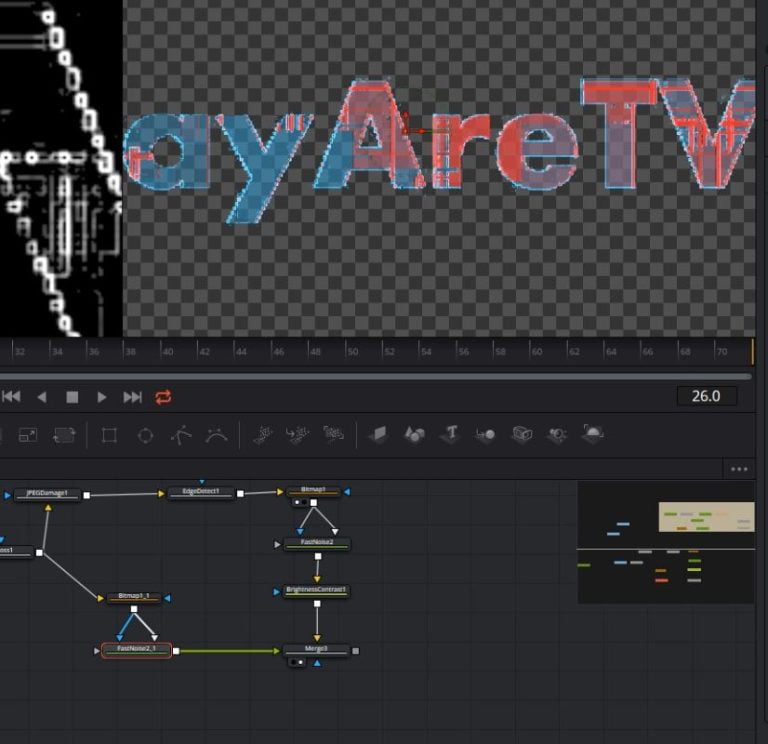
Now that we can see everything, you might want to go back and edit the inside fastnoise to change how look.
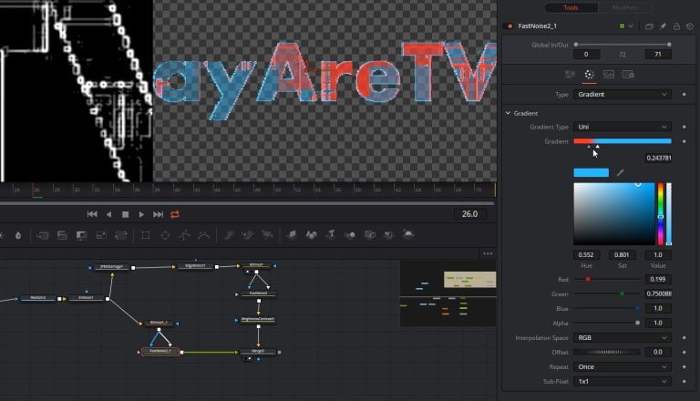
Next lets copy just the bitmap node again and use that to power how the merge works to cut off parts of the foreground part of the merge.
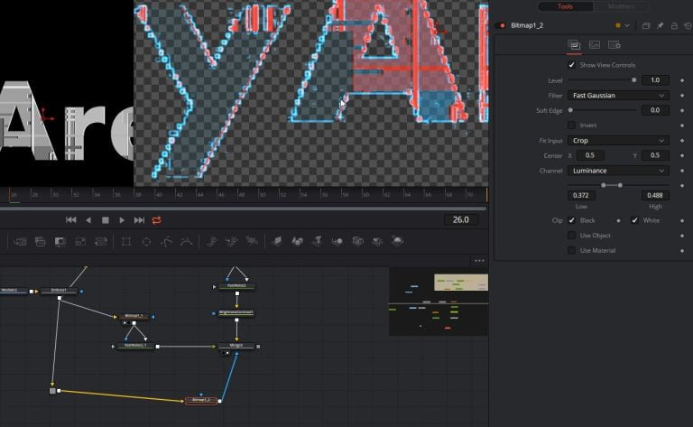
Within the new bitmap change the low and high for the luminance channel.
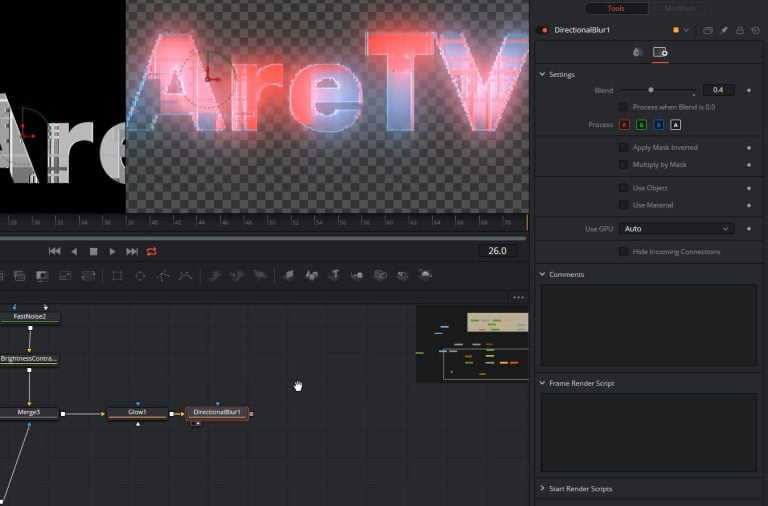
Coming out of the merge we’ve been working with we are going to add a glow node. Play with the setting till you get something you like.
After the glow we are going to add a directional blur. For this effect I like to change the type to centered and play with the length till I get something I like. I’ll also change the angle to 90 to it’s blurring up and down not side to side. This effect is a bit strong so I’ll change the blend on the setting page of the blur node. I’ll drop this down to something like a .4 It’s really up to what you like.
Next lets add the grid on top of this text. Connect the grid from the transform node to a merge as a foreground of the merge and the background being the text we have been working on.
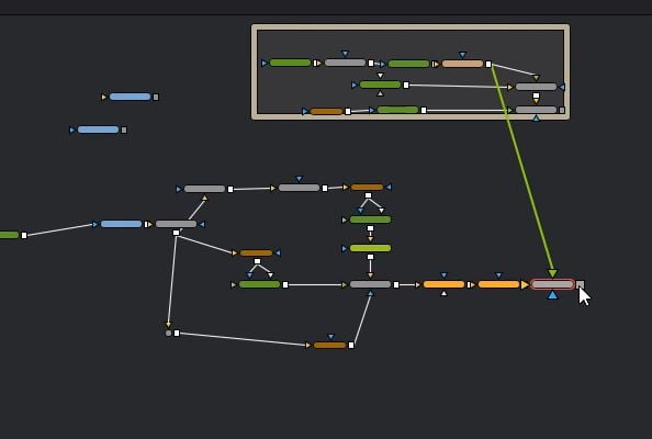
I like to change how strong this grid is so I’ll change the blend of the new merge to something like a .3
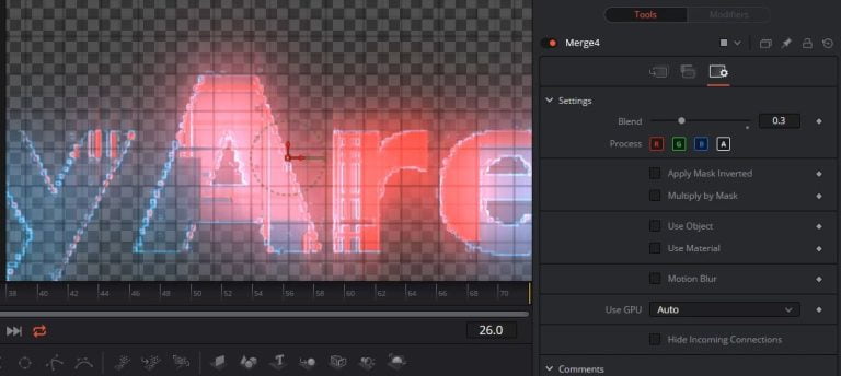
After this we will now add the background under this. Add another node but this time have the node tree we’ve been working on as the foreground and have the grey background has the background of the merge node.
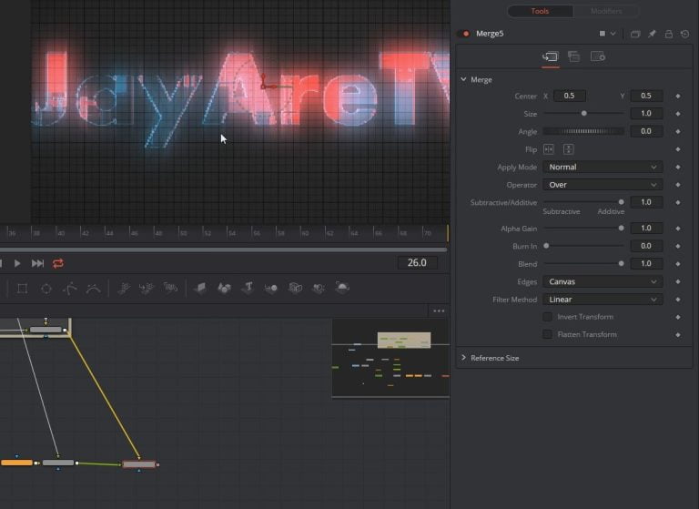
We have everything build now.
You can animate on and off the title anyway you want but this is how I did it for the tutorial. I used a text follower modifier
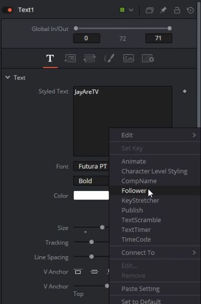
To get this right click in the styled text box and get to menu. Once you click on follower the modifier tab should be clickable now along the top. When you click on modifiers you should see the setting for the follower.
How the follower works is when you set keyframes each letter will follow the keyframes but with the delay that you have set. The first letter will be initiated with the key frame and then the following letters will have a delay whatever is set. Think of it like follow the leader.
For this project I used a delay of 1.
The other pages on this follower will use this delay.
I set keyframes for opacity and softness.
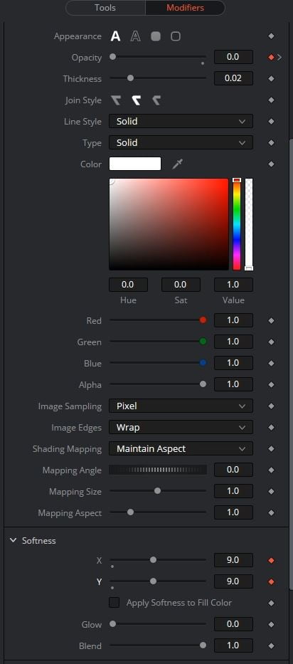
Just make sure you set start and stop keyframes for anything you want to happen in your animations.
I set up keyframes to bring the letters onto the screen and then at the end of the timeline I also set up keyframes for the letters to go away. Make sure that your keyframes aren’t at the end of the timeline because all of your characters are going to still have the delay of whatever you have set so you need to give enough room in your timeline for that delay to go across all of your letters.


